I Love Candy
This was a project done in my typography 2 class. Our task was to create three ads for your favorite candy. The three ads have to have specific focus for each ad. One focusing on the headline, the second focusing on the body copy, and the last one focusing on the image. I used my own imagery to make the layout and composition.
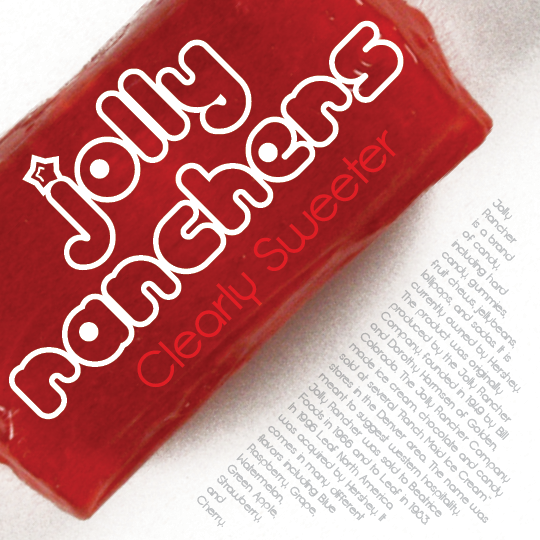
This design is meant to focus on the headline of the ad. I used the color of the candy to create visual interest directing you the headline in white to let it stand strongly against the red.
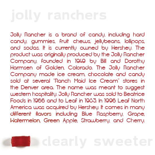
This design is meant to focus on the body copy of the ad. I used a simple layout because I wanted it to as readable as possible since the copy is the most important. I used the red of the candy to tie in the red into the copy so it's visually most important. The headline and tagline have less opacity so that their hierarchy on the page isn't in as high as the copy.

This design is meant to focus on the image in the ad. I let the image be the only thing in color so you eye is immediately brought to the image. I treated the type simply so they're understood and but not too strong so the image is still the most important.