BONDFIRE Camping for Families
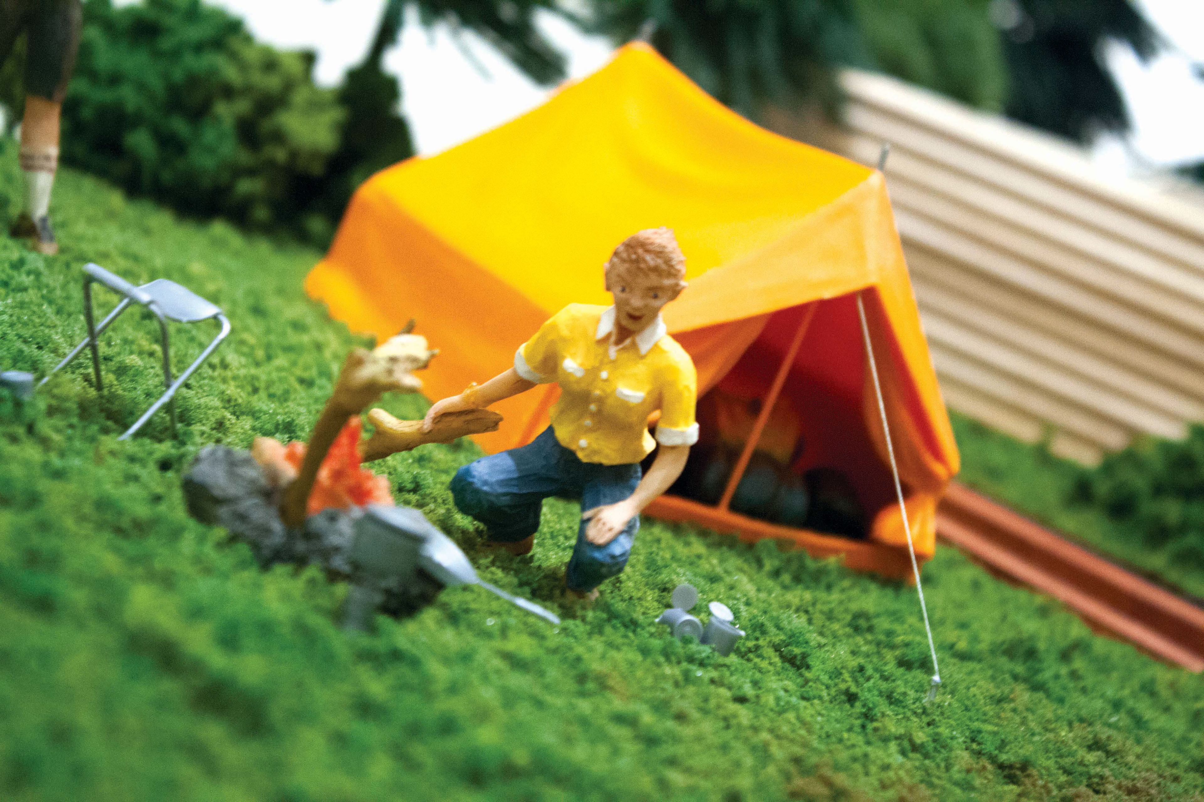
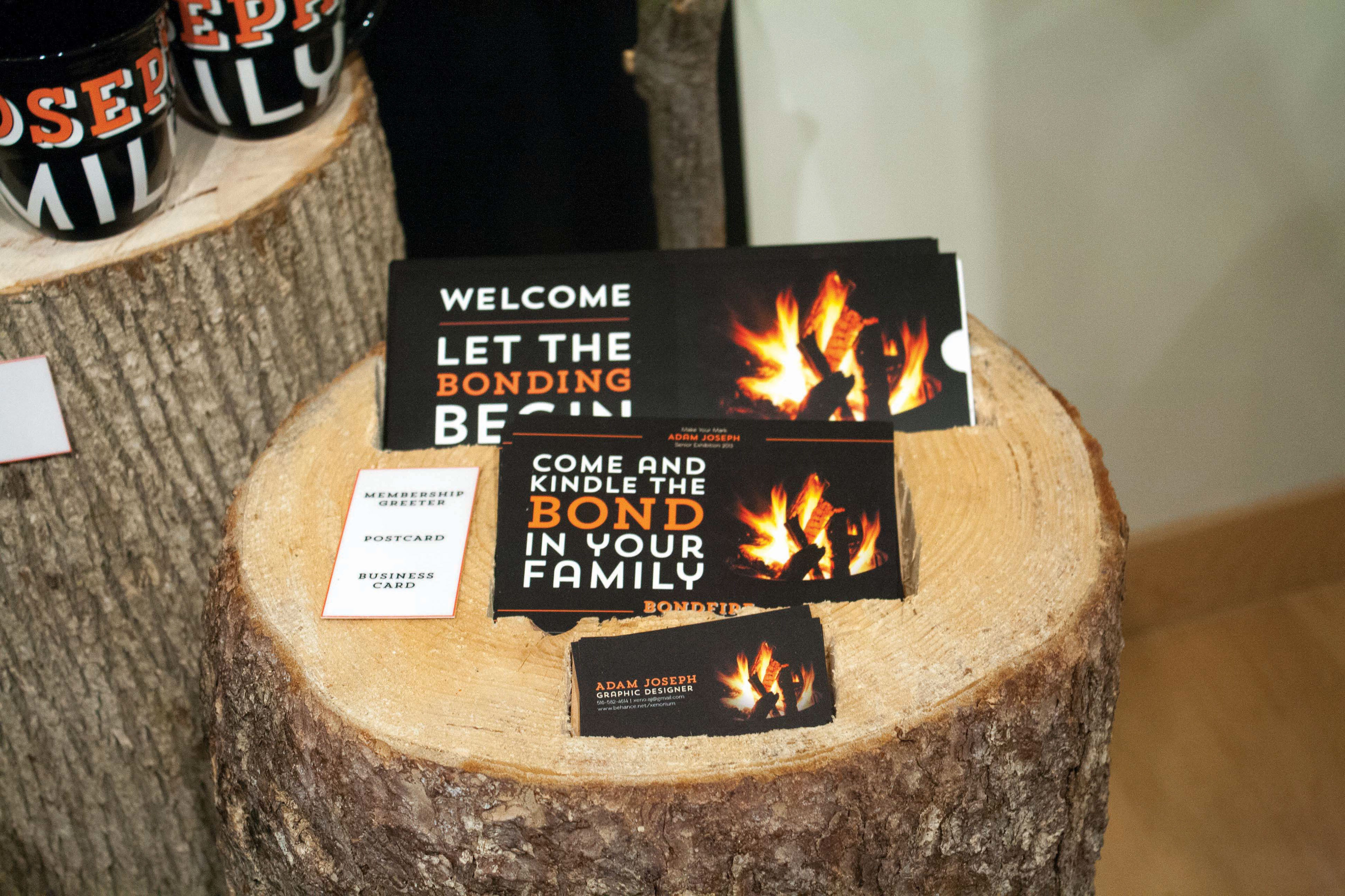
BONDFIRE is a campground designed to solve the problem of dimishing family togetherness. Through this project, design was used to create various things. A logo was created that symbolizes the unity of a family around a tent and the fire of the bond is in the middle. Logotype was also create to function clearly on a campground and be used throughout as consistent branding for various typographic treatments. A fully designed membership envelope was prepare for new campground members including: welcome, map, activity guide, packing/rental lists, and bus schedule. Families would also recieve a fully branded experience for their families. They would be branded through T-shirts, hats, and mugs. This would allow families to feel more together whether they were camping or not. Post cards were created to advertise the exhibition event that culminated the research and development done throughout the semester on the project. A fully emersive exhibition space was design and built to showcase the design and business strategy of BONDFIRE Campgrounds. With real logs and branches to add character and a very natural feel as well as a full scale model campground and facilities. Aside from the experience being well designed, the business end was addressed as well. Surveys and research was done to find out the true need for a service like this as well as the pricing structure to follow based on pricing of other campgrounds.

a simplified vector family holding hands. With the tent shows the fire of their bond.
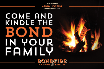
the glow of the fire at night while camping. The high contrast is carried through to the typogrpahy.


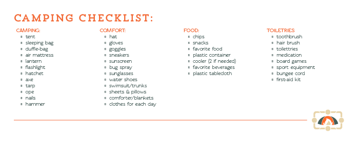
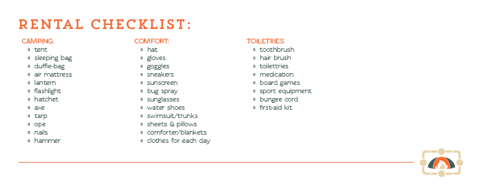
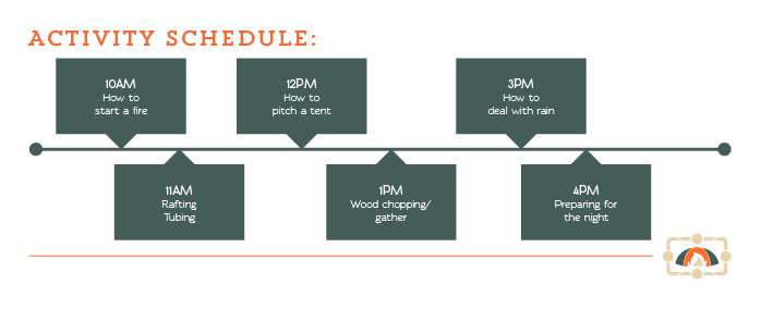


campground map, packing checklist, rental checklist, activity schedule, and bus schedule.


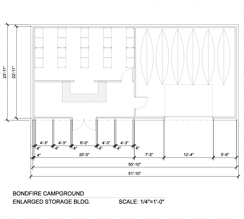


all the design and physical assets of the campground as well as its pricing.

Space were carved out of the log to place all materials into the logs.


